Wednesday, July 24, 2024

Artistic Choices (Practical experimentation - part one)

 So after the last blog I have a few different styles I want to try and experiment with when trying to craft an aesthetic that fits what I'm trying to achieve with this project. 

Firstly I'm going to look at some pixel art styles and how I can achieve that through digital software on my iPad using ProCreate. After looking through a few purchasable brushes and some brush-making tutorials, some purposely aimed towards pixel art, I was able to come up with the following instructions after deciding I wanted to create my own brush rather than buy one so I had some hand-made elements to the process. 

When creating any new brush, you simply click on the brush icon on the tab at the top of the page before pressing on the '+' symbol in the right-hand corner which will open up the brush studio.

The first thing I want to do is alter the stroke path (the properties of the marks you make such as thickness or smoothness). Reducing the spacing down to none to make the line as small as possible.


After this, going into the properties tab to alter how the stroke works as a brush, this affects things like the pressure you put on to the tablet being represented within the marks made. I want there to be a consistent mark no matter how I draw on the tablet so minimum and maximum scales need to be identical. I reduce the sizes down to none so the smallest size mark will occur no matter how much pressure I use and set opacity to max so the strongest possible mark will always be made.


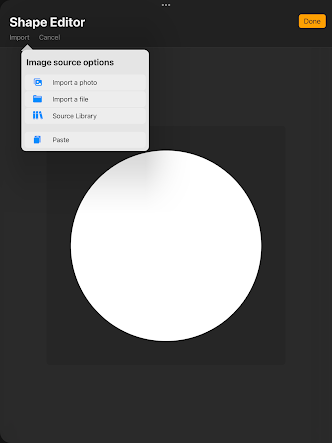
Next, I want the slightest softness to the edge of the brush design, the easiest way I found to do this was to import a preset design from the source library, clicking the shape tab on the left and then clicking on shape source allowing me to enter the shape editor screen, other versions have an edit brush tab at the top of the shape screen. This softer edge helps with a pixel technique called anti-aliasing for smoother transitions between lines when curved.


After that step I want to change the grain of the brush to get that iconic square shape for the pixel brush, choosing a texturized grain before maxing out the scale, depth, and contrast scales and reducing brightness to -75% to achieve this result.


A final step with the brush is to combat the integration of the Apple pencil, the iPad has a system where it can be chosen to only recognise when the Apple pencil is touching the screen to avoid mistakes from your hand touching the screen when working on a piece. For this reason, there are some properties to adjust in the tab to maintain our settings for the pencil so all I do here is reduce opacity to none.


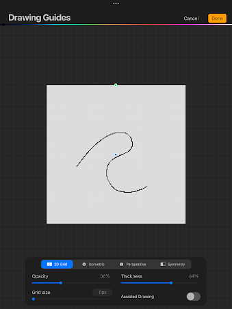
Now I have a pixel brush in my library and named it as such the final thing to look at is adapting the canvas to help with any artwork. We can use gridlines for this including an isometric one if we wanted 45 degree lines. If I opt for a 2D platformer style format I will stick to the 2D gridlines.


Reducing the grid size down to zero sets the grid to individual pixels regardless of the size of the canvas making it much easier when altering linework.

And here we have the finished result of the brush with added grid lines as a drawing guide. The first experiment will be to use the iPad to take a picture of a previous design and drag it into ProCreate and draw on a transparent layer over the top of it to see how the design works as pixel art, before experimenting further by altering the design in a variety of different pixel formats (8-bit, 16-bit, 32-bit, top-down view etc)


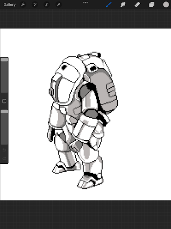
Here you can see my process at work when producing linework of my previous artwork in a pixel style, one thing I found along the way was having to reduce or in some cases entirely remove details to make the linework look ideal. This may be due to working on a much smaller canvas (200px by 200px) where working on the same size canvas and then reducing afterward may have worked but it probably would have reduced the quality of the linework with shades of grey to produce an anti-aliasing effect for the curved lines, a similar thing happened when I tried to create shapes like circles for certain parts of the armor and then alter there shape to fit the original art.


Added shade with a tri-colour palette similar to 8-bit art. There is no actual definition for the difference between 8-bit/16-bit/32-bit or 64-bit when it comes to the art style, it refers to how much data is used, SNES style is another term as that's where a reduced style like this would come from which had less data space on the hard drive to run high-quality graphics. A smaller palette displays this reduced graphics style though the linework isn't as reduced as what you might find in these older games making it appear more like 32-bit. 
Some 8-bit Mario sprites showing the reduced number of colours and details able to be used.

A higher-quality pixel art style showing off how pixel art can still display high-quality details so it shouldn't be thrown away as an experimental art style for my project. Worth noting the characters and interactable objects have black linework around them to help them stand out, something I was aware of in my previous post when looking at relevant art style options and their pros and cons.


Here is the villainous character Bowser from the Mario series of games displayed in a variety of bit options to show this increase in detail and colours. I do prefer the 32-bit option the most as it holds the retro feel whilst having the most details before becoming 3D or more vector-based as a 2D art style. In these more detailed versions, it is only the characters and their history that cause a player to reminisce not the actual art style which is what I would need to rely on since my project is not part of a lengthy franchise but a stand-alone one.
I need to continue experimenting with this pixel style producing sprite sheets (images of characters in multiple positions that can be placed into animation) as well as environmental pieces, as well as delving into some of the other art styles I've suggested in the previous post.



Wednesday, July 17, 2024

Artistic choices (continued player character design)


As you can see above I am continuing to develop the idea for the player character, knowing it will be a hollow space suit with minimalistic detail, top-heavy with rounded friendly features primarily a white/light grey colour. Constantly asking questions about the design every time I take one of the thumbnails and develop it a little further into an illustrative piece. How would a human fit into the suit, how does it open or close, do I like the silhouette or profile of the character, what features does it need from a modern-day suit, how does it move, jump, run, etc. 

What can further develop these ideas is understanding the other artistic choices that need to be made during the process, some may lead to certain choices becoming more necessary or certain designs becoming stronger through the process. I'll be looking at games, films, and other media that seem to excel at themes, mediums, styles, and tones whilst experimenting with my own designs to see which will give me the best result that I am after with this game's concept art, illustrations, and environmental art.

SPACE
Obviously, with the game being set in space or more precisely an unmanned alien planet being mined for minerals, it is imperative to look at what sort of games, films, and other media have used this environment for and how they designed their worlds to effectively convey whatever reasons they had chosen space for, be it horror, isolation, discovery or something entirely different. With a range of different pieces done on this theme, I can pick and choose what aspects I like and mix and match them for interesting and unique discoveries, something other illustrators have done before often for comedic effects like illustrating the horrifying creatures from 'Alien' and 'Predator' in a Hannah Barbara or Disney style.


Obviously, I'm not looking for a comedic effect for such a serious topic as grief. Still, perhaps a similar juxtaposition could be found to make a dark and serious subject matter more accessible to a younger audience or make players more active in participating in a game that deals with this topic. The likelihood is that many of the observations I find interesting from what has come before will mix together fluidly rather than oppose, mainly due to having the same goals/target audience/themes etc but also I do not wish for everything to juxtapose so as to not create too many distractions from the message trying to be sent, it has to be used sparingly and for the effect of enhancing the player experience. 

Aside from games it's worth looking at films and television for aesthetical choices made in their design especially if I can see any concept art or interviews with creative teams on said products, paying close attention to shapes and forms used to see if they fit in with the sort of worldbuilding I wish to achieve but also the contrast between shapes when it comes to protagonists vs antagonistic elements. A list of the sort of products I'll be looking at with some suggestions from tutors and peers included;

Alien series
Moon
Elysium 
Lost in Space
Star Wars
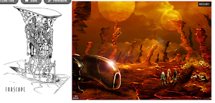
Farscape
The Martian
. . . among others


Space has been used as a setting for a variety of different genres of games with the most frequent ones being adventure, exploration, and horror games. Of the three of these types an exploration game would have more valuable takeaways since in my own work I'm aiming to have the player explore forwards through the game as they journey through grief, though it is worth noting how well horror games evoke emotions from players through aesthetic choices/ sound/ composition of environment. For example closing the player in to cause feelings of claustrophobia as well as lowlighting to increase fear and anxiety - feelings that can be expressed in the first stage of the Kubler-Ross model of grief. 
'Dead Space' corridor during gameplay

Another gameplay screenshot from 'Alien: Isolation' this time

As the above images show in the horror games set in space use lighting to create atmosphere and claustrophobia to evoke tension in the player and this is just still images without musical score or sound effects and other movements to create 'jump scares'.

It was one avenue I have thought about whilst brainstorming, since the planet is a mining operations the tunnels can cause a sense of claustrophobia but also the player character may have to remove pieces of the suit to get into smaller and smaller spaces just how as individuals suffering through grief we can often attempt to remove aspects of our personality to avoid the same trauma again - how often do see people who have suffered a bad break-up becoming more cold-hearted and avoiding or rebuffing feelings they once found joy in such as comfort or human connection, some even go as far as to change their appearance through a change in wardrobe or a haircut. There is a need to be careful over the use of these horror game staples when wishing to evoke similar feelings for a different cause rather than horror and terror but I believe it is the combination of several factors that allow a game to be successful in the horror genre and if I only use the claustrophobia aspects with other factors (ideally ones that lean in to grief) then this would be avoidable. One way that this could be overcome is through aesthetical choicesand sound design, most horror games in space that rely on things like claustrophobia, isolation and lowlighting tend to have a realistic level of detail in the graphics and a first-person perspective for increased immersion where as well as tension inducing scores for the music, a 2D sidescroller with simple graphics maintaining soft lines and shapes would alleviate the sort of fear coming from a horror game but still give that same sense of the walls closing in but more towards the anxious feelings after a grief incident.

Looking at space games that lean toward exploration and how they may offer ideas during my creative design process, particularly what design choices they make to drive the player forward on the journey. It's very easy to succumb to the idea of quest markers and mechanics that force the player to move from place to place such as space games like 'Starfield' or 'No Mans Sky' but we want a more natural progression for the player, like a self-driven desire to see and experience more of this alien world. This does sound contradictory to having the alien world also evoke feelings of apprehension, as your brain can not be overwhelmed with anxiety if it is encouraged to be curious. It is an often used therapeutic method for those suffering from anxiety to instead focus on asking questions about their feelings and whether the source for them is internal or external, however, this can be used to the advantage, allowing the player to feel apprehension more so in the first stage but then give them the tool of curiosity to overcome their apprehension through the use of creative choices found in other exploratory games so that they push past the anxiety and apprehension to carry on journeying through the game. Perhaps this is where the second player who can interact with the environment can come into play, it's certainly something not present in horror games and would remove some of the isolation from the player whilst still being aware that the world they're in has no human connection for them. There is also the idea of having different sets of emotions evoked during the different stages of grief being represented, this change in emotions being evoked should allow the player to understand the progress they've made both through the game and individually if they were to go through a grief event. Therefore it may be okay to have certain environmental design choices made in the first stage to cause the player to feel anxious but once they have progressed onto the next stage they may feel more exploratory in the next stage naturally. One artistic way I've found exploration based space games (especially more indie developed digital games and traditional board game format ones as opposed to AAA studios) is the use of interesting or unique artistic mediums being used or failing that have nice charming simplistic art styles so as to not detract from the message.

First we have Halcyon-6: Starbase Commander, which is a retro space strategy RPG with base building, deep tactical combat, crew management, and emergent storytelling. OPting to use a pixel based art-style to tie-in to it's retro theme and the heritage of turn based combat games such as early 'Final Fantasy' games. The use of a retro style of aesthetics could be apt for a game dealing with grief due to the amount of reminiscing and ruminating one does when suffering from grief whilst also being a game art style that bridge a generational gap between young players who have an elderly person as their second player if I continue with the idea of having two players journey together to create an experience where one can come to terms with the loss of the player after the game.


Next is 'Outer Wilds' a 2019 action-adventure video game developed by Mobius Digital and published by Annapurna Interactive. The game follows the player character as they explore a planetary system stuck in a 22-minute time loop that resets after the sun goes supernova and destroys the system. Through repeated attempts, they investigate the alien ruins of the Nomai to discover their history and the cause of the time loop.
Whilst a first-person perspective is used throughout the gameplay which is not something I'm utilizing in my game due to its two-player emphasis and wanting the player to have a more back seat role for the characters the art style is quite charming with a cell-shaded sort of style with hand-drawn looking elements. Unity and Outer Wild's art director and environment/VFX artist released a video where they discuss how each planet in the game is made. In the 2-hour video, the team reveals that the visual inspiration for the game came from the "camping in space" prompt, which is a mix of "rustic backwoods naturalistic environment" and the '60's-70's era NASA." The art director says his main goal was to not just make the game look pretty but to enhance the design. My opinion of having a beautiful looking environment will encourage the player to explore is held up by this games ar direction with emphasis being on the player needing to explore to solve the mysteries within, similar to games like Zelda: The Wind Waker which also has exploratory themes and a simplistic cell-shaded art style, though opts for a much brighter colour palette due to a lighter tone of the narrative. One observation of Outer Wilds is that despite the prompt of having "60's-70's era NASA" as a prompt the space aesthetics of ships and mechanical elements seem more futuristic than I would prefer especially in comparison to films like Alien that were a 90's interpretation of what future space travel could look like yet has a more archaic feel to it that I like in terms of an art direction that could lead to the player reminiscing, especially an elderly player towards the end of their life.


Looking beyond just digital games and into the realm of traditional board games to see how illustrations and art styles can evoke emotions without animated elements to further evidence how an art style alone can be used for my themes and messages. 'This Ship is a Tomb' is a kick starter released board game presented as a 72+ page derelict crawl through a massive vessel that changes as you explore. Designed for the Mothership sci-fi horror RPG, this module was inspired by stories like Event Horizon, the reverse of Firefly/Serenity, the borg of Star Trek, and of course the Alien franchise. Created by James Hanna who took part in a 3+ hour long live-stream on YouTube with 'Plus One Exp' to detail how the game plays and some of the ideas behind its creation, detailing how the art was produced by Dane Gaydosh to help players' imaginations during the tabletop game. This is evidence that art in a tabletop game has to run double duties compared to digital video games, not only evoking emotions in the players (in this instance more toward horror and raised tensions) but also being a catalyst for allowing players to use their own creativity and imagination when it comes to immersion in the gameplay, thus proving a higher importance in the choices made during the creative art process and the styles picked for artwork/illustrations within the product. I'm more interested in looking at Dane's linework and character design rather than colour choices since black is the major one used (often cold greys are used for colour with red spot colour usage for gore and blood as well as minor details) to push forward the macabre theme of the designs as well as a more isolated and claustrophobic feel relaying back to earlier research into horror space themes.
The line work is hand-drawn on a digital platform with a fine-detail sketchiness aesthetic to it, this level of detail lends itself well to the macabre themes and draws the players' eyes into what would be imagery that is gruesome to look at - like being unable to not look at a car crash, but is too distracting for my own game. I want the players to enjoy the art but not be distracted or pay more attention to artistic details than the theme or message, it can work for some exploratory games where players have to obsess over the details to find clues or hidden objects but I want. smoother style that is more enchanting and sets a more positive tone than this, I want the players to understand the positives of overcoming grief despite it being quite a dark theme especially if the grief is related to the loss of a loved one through death.

This separation between linework and colour making a difference to the tone of a game is evident when comparing 'This Ship is a Tomb' to both 'One Breath Left' and 'Notorious', both being tabletop games set in space with the latter being another one produced by James Hanna with Jason Price. 'One Breath Left' has a lot of black work used but the line work is minimal and has more colours, giving it a more comic book feel and potentially lends itself to a younger audience despite it still containing horror-based monsters as enemies. 'Notorious' on the other hand keeps the heavy use of fine-detail line work but reduces the use of black and blocky feel of the shadows with desaturated colours to give it a retro feel like old western movies which makes sense with its bounty hunter theme, like an intergalactic western. Even though neither of these styles has all of what I'm looking for it still shows how attention to these elements that make up an art style are all important parts of making choices during the process.

Finally looking back at digital video games, it is interesting to see the promotional art of 'No Man's Sky' that although being a highly detailed and first-person video game with realistic graphics (all elements I'm keeping absent from my own work) the promotional and concept art looks more in line with the styles that I have enjoyed looking at during this research, lighter smoother tones, an almost cell-shaded approach as well as intelligent concept work for multiple alien worlds and planets to show character to the environments as well as creatures within the game allowing players to differentiate between locations. This is what I find to be a successful art style when opting to use the beauty and attractiveness of artwork to encourage the player to move forward on their journey.


GRIEF
The second major theme within my project is obviously grief or the overcoming of grief, when starting this course we were often discussing the idea of a game being a mashup of two themes that weren't often put together so as to create something new whilst relying on elements of similar games that had been successful before. Though this section does not need to be as detailed as the space section due to multiple blog posts already discussing my findings and experimentations within this theme, also it is not necessarily as large an aesthetic component of the game and is more of a narrative theme. This isn't to say that it cannot hold some significant importance when making creative choices since as already discussed artistic elements such as colour and mediums can evoke or represent emotions during the grieving process. One question to look at is why is the medium of watercolour so often used when depicting images of grief/loss or upset. 
There are a lot of obvious similarities between the medium and the emotions on surface observations; there is a delicateness to its visuals as well as a soft tenderness with desaturated colours giving ethereal and dream-like imagery more strength in this medium compared to others, when using watercolours a lot more control and patience is required due to its longer drying time between layers as well as how much it can run on the canvas and blend. Time being the overarching component of overcoming grief, but the smoothness of this medium contrasts with my fondness for the sharp details of cell-shaded art so how can they be brought together as an art style that works for my themes. Imagining the mashup of Zelda: The Wind Waker with work from artist Jean James for pieces such as "My Chemical Romance's" vinyl edition of 'The Black Parade'.


Obviously the different art styles work because of the products they have been produced for having different needs and target audiences. Zelda being aimed to a younger audience with an emphasis on exploration and the joy of adventure whereas The Black Parade is a concept album that has each song represent the events of a cancer patients life as they look back and reminisce on the life they have lived. Both individually hold relevance to the themes present in my own product but separately require the contrasting styles to work effectively in their own place, being able to bring them together may not be successful for my own work but is certainly worth experimenting with to find a unique and new niche way to produce art that can work in a new way.


One option is to go in the same direction as artist Sarah Menager who takes aesthetic qualities of watercolour and produces digital cell-shaded style work, looking at the desaturation of colour and softer, lighter tones to keep the ethereal feel whilst still maintaining sharp contrast with shadows. A lack of black line work and smooth curves help complement this style but placing a character in this world could lead to the player loosing sight of where they are, there needs to be something to help make the player and interactable elements stand out. This is where I started to look at the animations of Studio Ghibli who work famously with water colour backgrounds but consistently have characters and foreground elements stand out so that the audiences attention is placed on what matters whilst still being able to enjoy the idyllic environments and worlds built within these stories. 


These animation stills clearly show the distinction between characters and backgrounds that I previously described being a option for mixing cell-shaded art with watercolour. The studio is renowned for hiring only exceptional watercolour artists who can meet the high standards already set from previous animations from the company, crafting magical watercolour backgrounds that are reused for multiple cells of the animation as the characters are illustrated separately as a hand-drawn element over the top of the frame, the founder Miyazaki detests the use of CGI in animations wanting to maintain the human element of the art style to coincide with the immersive realism within the art and humanity present in the narrative. The simplistic style and shape of characters may be a choice made to help the younger audience engage with the stories that often have darker or mature themes, this choice has been discussed previously in this blog when looking at Scott McClouds "Making Comic Books" where slowly removing more and more details of a characters line work allows for a wider audience to relate to said character.


It also helps separate the characters from the background, they are the only element with black outlines, and the sharp contrasted shadows and highlights juxtapose the smoother backgrounds. The world I create for my project is just the backdrop for the game with the journey of the character and their own thoughts and feelings being the priority of what the player is engaged with.


THERAPEUTIC METHODS AS UNIQUE ART STYLES
Observing words and phrases commonly used and interpreting them as a viable means of an art process is a final option for experimenting with during the creative process, and comes from advice given when attending this years Yorkshire Games Festival, in particular the presentation from Henry Hoffman (founder of Newfangled Games) who experiments with new, unique mechanics that he implements within his games as the foundation with which to develop the product around. For instance messing around with the colour wheel on photoshop led to his development of the game 'Hue' an inventive indie puzzle-platformer where the player controls the background colour of the game so as to remove platforms/obstacles and such that share that colour from interacting with the player.

Now whilst I'm not primarily looking at the mechanics of my game during this module, there is no reason why the process of looking at abstract alternatives cannot lead to a serendipitous moment on my journey of experimentation during my creative process, one particular option I've imagined came from the process of 'unpacking' ones own trauma during therapy sessions leading to me looking back at origami and pin animations I've previously looked at during animation classes in my Illustration undergraduate course. The idea of having art and graphics similar to games like 'Paper Mario' and 'Lumino City' (the latter being hand-crafted paper animations too) with an authentically represented human-made element to the game giving a sense of a delicate hand guiding the player through this journey of overcoming grief seems very attuned to my own messages for the product, having animations for the player character being origami-like unfolding of paper showing how they unpack themselves to move forward or having to remove parts of themselves to progress through smaller sections of the mining planet as discussed earlier like how we can often remove parts of ourselves to overcome the negative emotions we are subjected to when facing grief. It would certainly be a unique way of handling the art of the game, can maintain sharp shadows on the characters with backgrounds using watercolour to fit in with previously researched ideas but only through experimentation can I find answers to how well this could work.


Learning Agreement 3 - DE4405 Specialist Practice

  NAME - John Michael Padden MA COURSE - MA Game Design DATE - 04/09/2024 VERSION NUMBER 3 Brief Explanation / Outline of Project / What?   ...