So after the last post researching the denial stage of the Kubler-Ross model of grief and how this theme could be represented within the art and mechanics of a game to benefit the player by giving them the tools to deal with their own grief or help others suffering I'd already started to ponder where the game could take place and what the character would look like.
From my understanding grief is a journey we have to travel through and overcome all of the necessary stages to finally reach a level of acceptance, so it made sense for the protagonist to be some sort of explorer. Grief is such an alien experience to most of us, especially the first time we experience it from the loss of a loved one (though it can feel different every time we experience it as grief never acts the same or evokes the same emotions for an individual) having an explorer on an alien world felt right to me. This could lead to some of the feelings previously explored in the last post, a world alien to the player could lead to apprehensive behaviors and a fear of what could lie ahead. Mechanically having a fictitious world like this could free up ideas of what could be accomplished during gameplay as the same set of rules would not apply to the game as do in the real world. Gravity could be altered to cause the player to be slow-moving and sluggish during depressed stages, storms could ravage the land with a different air pressure to simulate the rage and frustration of the anger stage, before the player moves to the dark side of the planet to reduce light levels and succumb to a dark and foreboding feeling during the journey to acceptance. The main advantage of having the setting as an alien world is to have the player feel lost, they don't belong here and are confused as to how they got here or why they have ended up in this place, perhaps denying that a grief event has taken place and that this may be a training exercise in a simulation.
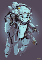
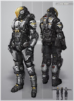
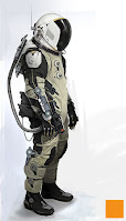
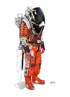
So with a preliminary setting and protagonist established it was time to start sketching out ideas for the look and feel of the character. How they move and act, what abilities they have, and what their purpose was could all play a part in the design but firstly I wanted to look at what was out there to see if that could spring some designs forward. Choosing to mood board a lot of space figures alongside sketching and asking questions about the design hoping to lead toward some sort of semblance of a protagonist.
Starting with current-day astronauts and understanding the functions of the suit, what was necessary to the design but could possibly be altered through an artistic license, and what could be removed, edited, or added as something entirely new for the new environments to be explored.


As you can see from the above Starfield armors even though all the player models are female, if they were wearing a helmet I doubt there is any design features that would give a hint of the gender but still retain the human form, so I started to rough out some armor designs using copic alcohol markers, brush pens, and Prismacolor pencils. Focusing on having a large visor on the helmet with no identifying facial features after first attempting focussed shapes for the visor made me realise I wanted a large rounded shape for the visor.
What seemed to draw my attention the most during this continued process of research and design was the larger mechanical suits with less focus on human form, suits that had an almost pilot space for them, the idea behind this was having a suit that was empty and after the crash was attempting to find their pilot (or find what was missing from inside them) as when suffering through the journey of grief or loss we often feel a hole within us like a piece of us is missing and I liked this form of representing this feeling by having a hollow suit.
Looking in particular at games like Bioshock which had two themes collaborating together to form the design (steampunk with underwater) I felt this was a direction to look into as well as keeping a more rounded shape due to the cognitive dissonance between the protagonist and the environment or enemies as explored in one of my first posts (round character and sharp pointed enemies or objects allows the player to easily gain visible reference for what are going to cause damage to the player.)
Firstly knowing one of the two themes would be space travel I started to opt for medieval or knight-like aesthetics as the theme to pair it with in the design due to the inference on my part that someone offering to help another through grief was an act of a 'white knight' so to speak and having a pale colourless armor in white or light grey would represent this but also allow for the environments to colour the armor as they progress through the journey, imagine a red dusty rocky environment like Mars that kicks up dust as you travel through it giving the player character some red stains on the armor representing the anger stage of grief.
Secondly, as I was looking at shapes for the design, mainly rounded shapes as previously mentioned I also liked the idea of the main bulk of the shape being an upside-down triangle. Triangles are known as the most stable of shapes when sitting on their base when it comes to engineering or architecture but if we turn that on its head the triangle struggles to stand up without falling over and I liked this idea of instability in the player design to represent how unstable our emotions can be during this journey, and as I progressed through thumbnail designs I opted more and more for designs that had a more isometric theme with one side looking heavier than the other to further enhance this theme.


No comments:
Post a Comment