One area I have been asked to research during the concept and character creation of this game is the different ways in which illustrators/concept artists/visual communicators create their own characters and if any of their processes bear similarities to my own and if there is anything to be gained in the analysis of this approach - do certain processes work better for certain creative elements of a game than others? My own approach to concept art has me start to ask questions that determine what process I am most likely to take, if it is a character/location/prop based on realism I will require more field research and observations of the real world e.g a character in a WWII game would require research and references from that era, if based on fiction then a more pragmatic approach is used asking questions of the design to help form visual answers. For example if creating a character asking questions of what environment they live in can lead to discussing how they move through this environment, how many legs/arms they require maybe wings are necessary etc.
A series of sketchbook pages from Ari Gibson during the creative process of Hollow Knight
When it comes to concept art and character design in terms of a known and understood methodology or practice I feel Julia Rässa summed it up perfectly in her Bachelor's Thesis titled "Concept Art Creation Methodologies" (linked at bottom of this post)
"Upon reviewing literature it was found that there are numerous ways one can perfect their art and design skills but there was little to no theoretical consensus on what the foundation of a concept artist's workflow and what their key steps in the process are."
It is much more beneficial to look at the work methods of contemporary concept artists to cross-analyse and disassemble their core disciplinary components, though the transparency of professional concept artists and art departments when discussing this is scarce.
In terms of concept art that predominantly looks at realistic worlds (though with some creative licensing) watching the "Inside Pixar" series offers a behind the scenes look at how the companies different creative departments work, the episodes that offer the best insight for character are:
EP 12 - Foundations: Creating a Character
EP 17 - Unpacked: Everybody Loves a Villain
EP 18 - Unpacked: The Squint Test
But perhaps the most insightful was the second episode that was spent with Character Art Director Deanna Marsigliese as she described different ways and means she produced characters. She discusses how she implements mood-boards as her starting element of the process as well as observing the world outside for any happy accidents - one such occasion was when she worked on "Luca" and was able to go back to her familial roots in Italy for exposure to the environment and what it could bring to her designs with the films setting being based on the Italian riviera. This practice of visiting places for a realistic reference is often utilised by Disney and Pixar with the creative team travelling to Scotland during the creation of "Brave" but also employed by multiple creative industries. Graphic designer Jennie Potts travelled to the distillery location whilst working on a scotch rebranding whilst for Reportage Illustrator Olivier Kugler its a necessity to travel whilst producing observational drawings on subjects for editorials and published materials such as his book about the refugee crisis, gaining valuable first hand experience and reference points for his work.
 |
| Character concept art from "Luca" |
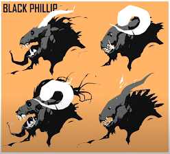
Another useful source for visual information when it comes to concept art and character design is the YouTube channel "Proko" created by Stan Prokopenko who, whilst creating instructional art tutorials, hosts multiple other artists on his channel who offer insight into their own methodology and practice when it comes to the design process. Scott Flanders is a digital concept artist with multiple appearances on the channel with a vastly different approach to the aforementioned Marsigliese. Flanders uses the term "Designing from Abstraction" as he describes his process of placing down interesting shapes and evaluating them in real time, allowing his existing knowledge of anatomy (particularly reptilian and paleontological) to determine how certain shapes should co-exist or interact with one another. There may be some similarity between Flanders real time evaluation of shapes and the evaluation and questions Marsigliese asks of her own mood boards.
Using his designing from abstraction method Scott Flanders turns the shapes on the left to those on the right.
I find more fantasy artists utilise this approach when creating characters as the art doesn't have to make 'sense' per se, Wizards of the Coast Senior Concept Artist Hidehisa Miyagawa when producing a new dungeons and dragons creature, freelance fantasy artist Christopher Lovell or even Games Workshop sculptors - the visual elements drive the creation process forward with existing knowledge of shape and form helping with the real time evaluation as opposed to the previous approach of gathering as much information and references before the sketching begins. The idea of two distinctly differing approaches seem to be similar to the findings Rässa found in her thesis with the idea of realism vs fantasy as the key variable that may alter an artists approach with a secondary one being the company developing a project (AAA studio vs Kickstarter indie game). However her separation is between artists who ask questions of the world/enviroment the character is present in before consequently starting the ideation process and others who immediately reference gather and research. I wonder if there I see more overlap between Rässa's two processes because some larger studios may have teams in the development process who fit one role of gathering reference so another team can ask questions and then bring all ideas together, or because both of these styles are something I have seen used together by creatives across all four major illustration disciplines (publishing/editorial/packaging/advertising) during my Bachelor degree.
The practice of visiting places that hold reference to themes or settings of the creative body of work is something I can relate to especially for the more realism based elements of the product, and seeing the use of a mood-board bears similarity to the serendipitous moments I would have when collating visual imagery from inside the human body, biology textbooks or photographing physical organs. It's the visual connections you make when seeing all this imagery down in front of you that can spark the creative process, no fear of making the wrong marks on the paper when sketching with this process as its just collecting information from others. This was especially helpful when designing a character that was a vaccine - basically a liquid, looking at cells and other biological imagery allowed me the freedom to use a nucleus as an eye whilst seeing images of explorers on alien worlds made the connection between the visor of an astronaut bearing a similarity to a huge cyclopean creature.
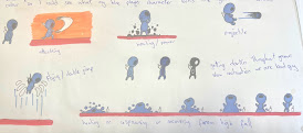
As you can see through the development of the character above I initially looked at different face variations, discussing how they were becoming too complex and simplicity was more valuable to the design to allow for more immersion for the player as well as softer shapes being used with a blue colour to contrast what I believed to be a common colour of red, pink and orange for internal pictures of the body. The choice of a more simplistic or abstract nature came from looking at Scott McClouds "Understanding Comics".
Whilst looking at the informative article at Gamasutra (now known as GameDeveloper.com) titled "The Aesthetics of Game Art and Game Design" allowed for a greater understanding of harmony and dissonance when it came to the design of the protagonist in contrast to their proposed environment.
Later in the process looking at how the character moved and posed, though sketched in a 3D format it was still informative for a 2D game to get a 'feel' of the character, how agile they were, whether there was a need for a tail (not just for mobility but a directional and speed indicator) and finally reducing the size of the body in comparison to the head to create a more innocent and youthful appearance since the start of the game is technically the birth of the character and was a successful practice not only employed by Pixar but also other indie games such as HollowKnight, Super Meat Boy, Binding of Isaac and Spelunky. Retaining the belly button was also a choice, with no distinguishable facial features the character holds very few details for us to associate with, leaving the belly button in is a recognisable visual element that hopefully makes the players recognise a more human presence in the protagonist.
This is just the initial start to the visual design process of the protagonist with more questions needing to be asked and answered till a fulfilling and successful one is produced. Some of these questions will be found in the research of personality during this creation process in the next post.


No comments:
Post a Comment