Saturday, August 24, 2024

Artistic Choices (Practical experimentation - frustrations of watercolour)

 Having already spent some time experimenting with pixel and cell-shaded art styles I wanted to try some of the other mediums my research had suggested starting with watercolours.

Having seen how well games like Gris and Spiritfarer utilise watercolour or the aesthetics it can produce to give a light and delicate feel to the art and environment to both emphasise the delicate subject matter and also keep a light and calming environment for the player to game in whilst traversing subjects like death and loss, as well as seeing similar art mediums used in series' like studio ghibli films I had found it to be a worthwhile experimental endeavor despite my relative lack of knowledge of the medium.

I watched videos from some professional artists of the team who worked on Studio Ghibli films as well as took notes from several watercolour tutorial art books.

Link to video below

https://youtu.be/qH2q9ZJMaAU?si=7jAh_E0ExWnQkENS

Starting with a very basic of attempting a colour wash with a slight gradient, this would start of the sky background to the anger stage of the game and anytime you start a painting you begin with the background and work forward. However the paper wasn't the best quality and a lot of tiny bits of paper came up with the wash.

Once dried and the paper removed lots of little marks were left behind, whilst an interesting texture with some artists opting to sprinkle salt down on washes to get a similar effect it isn't what I'm looking for.

I tried again with different paper, this time letting each layer dry before adding another layer leaving a little of the previous layer showing to create a layered gradient effect. I also opted for a sponge brush rather than a bristle brush this time to give a smoother stroke and slightly less harsh texture to the blend.

Once all layers had been added I took a clean wet brush over the entire page to try and blend the layers a little more creating the image below.

I like the effect of the watercolor and it achieves the dreamy delicate look I thought it would but the colour is perhaps a bit too saturated, attempting it again with a more diluted mixture could achieve this but also some digital editing in Photoshop could alter the original wash for the same effect. I also want to contrast this with a watercolour brush on ProCreate to compare the two versions of the medium. The digital one will certainly be quicker reducing the time for drying (despite me having a hairdryer to hand to help speed that up).

Using the three colours from my previous digital workup with a large watercolour brush.

Then used the blend tool to create a seamless blend, though this removed too much texture so I go back over with the watercolour brush but with a much lower opacity before eventually adding a bark texture brush over the top to give a dusty feel to the sky, it isn't a natural sky colour and is meant to exist from the abundance of red rocky dust being kicked up into the air from the years and years of mining on the planet which leads to it discolouring the players white armour.

Still very saturated but with it already being on a digital device a few clicks later I was able to reduce the saturation and opacity of the layer whilst maintaining the blend and texture.


Next, I attempted to craft subtle clouds into my more successful watercolour blend with a simple sponge brush and water to remove the paint and leave behind more and more diluted paint on the page to give a sense of a light mist-like cloud shape. This did not go according to plan. First using a sponge brush didn't remove the paint enough and was hard to control and secondly using a wet kitchen towel and dabbing on to remove the paint but like the very first watercolour attempt, it started removing paper as well. I also attempted to use Prismacolor pencils to add a planet to this scene as I started experimenting with different media for creating imagery to populate the skies with.

Kitchen towel attempt on left, sponge brush attempt on right.

The work lacks a lot of control over shape design which can create more natural looks for these objects, in some cases desirable, but when opting to craft objects that serve a purpose of establishing the environment and scene and thus the emotions of the player then more control is necessary. Whether it's a skill issue or just impractical to achieve the results from this medium that I'm after, I'm finding an amateurish feel to everything I'm producing with this medium and causing great frustration in myself. I will still continue to work on this to see what else can be achieved as well as looking into crafting all the elements separately and digitally bringing together as well as looking into gouache.


I went back to my digital watercolour piece and attempted to produce clouds on there with a range of water based texture brushes, not only was I able to have a much higher level of control with both brush size and opacity and removing errors immediately but the textures were even more delicate than those of traditional watercolour.

I was able to duplicate clouds I had already made to start filling the sky up even more, simple horizontal flipping, resizing, and opacity changing makes them fit in with out being a repeated pattern.


I then reduce the opacity and create new layers over the top to add brighter smaller clouds towards the bottom adding depth, if the image starts getting to bright to distract the player I can change the opacity of the whole piece very easily as shown in the second of the two images below.


From here I went back to my pixel brush with it being set to a standard opacity and size to add very fine details to the clouds to bring back the weird water drop outlines that the original digital brush left, as well as adding stars and one shooting star to the sky.


Now I had multiple clouds to compare the methods and outcomes of against some of the cell-shaded clouds I had been attempting to make to conclude what style I was enjoying the most and what would be the most effective as an artistic choice in line with my learning agreements as well as the mood and atmosphere of the game to help the player with the subject matter of grief.


I don't know why but there's just something about these pixel/cell-shaded clouds that I really like, whether it's how unnatural they are - more like the weird bubbles in a lava lamp which gives way to the idea of this being an alien world devoid of water so these clouds are not created the same way as Earth ones are. Or the sharp crisp contrast that they have whilst also having the ability to just sit in the sky adding beauty but not being too distracting. However the watercolour clouds have their own benefits of being a lot more delicate and subtle and adding way more atmosphere and tone to the image, perhaps the best option is to find a happy medium between the two and ask other people for their own opinion of the pieces to get a more objective viewpoint on them.




Wednesday, August 21, 2024

Artistic Choices (Practical experimentation - part four)

 Moving forward from some of my previous thumbnails with the use of the pixel brush I had previously created in ProCreate to see how some exploratory art could move the images forward whilst still maintaining the knowledge gained from previous research and reference points collated.


My first pass came out looking like this.
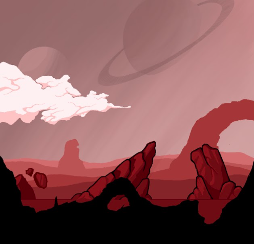
The more I coloured the piece the more I dived into a cell-shaded approach, with this canvas being much larger than the one used on a pixel version of earlier character art the lines aren't as jagged as a more zoomed in pixel image. Smoothness of the art was one thing I was concerned with when analysing my last piece, with wanting a simple and clean look to engage younger audiences more (something cell-shaded design certainly does) but by having an attempt to cross pixel art for its retro feel with cell-shaded it's almost mixing the two art styles of the ideal candidates to be playing the game - the older player teaching the younger one how to deal with grief for when the inevitable time comes when the older player passes away. However, despite enjoying the process and the freedom this style allowed for me to ambitiously draw how I saw fit, the cloud to the left is a big favourite of mine from this piece having distinct character, I still have some obstacles to overcome if this is to become the chosen medium.


The three videos below were big influences of the style I'm experimenting with here, the first video giving me some understanding of how Cell-shaded graphics were implemented into Windwaker and the GameCubes graphics capabilities. The second is a fan-made animation set in the Alien universe which harkens back to earlier research with the final video showing how a small cell-shaded cutscene was made in unreal engine.

https://youtu.be/mnxs6CR6Zrk?si=rVyt9AjL3sSon9E4


https://youtu.be/ShGElGusepA?si=M8AYumR9YCoMKsQV 


https://youtu.be/Vx5pmsVdrcY?si=DI3LY8WBik-s0TDk


In my head I know that the rock on the left is something the player character moves in front of as opposed to the other two larger rocks so I maintained the ground line along the bottom of the rock but that wasn't enough so I added a black line to the scenery that is traversable as can be seen below.


The next part I was very critical of was both the sky and the foreground, both have too much open negative space as well as technical inaccuracies when it comes to the planets being all one colour though they could be left as is if I wanted to continue with it as an art choice, it certainly matches the disappearing landscape with their own blocks of a singular colour. But I want to use the sky during the beginning of the game to show its beauty and tie back to my earlier requests when starting this project and looking at other games about having an attractive arty hand-drawn style to this project. Though being a novice to the ProCreate software it would require some trial and error processes when it came to using tools to develop these planets the way I wanted, getting used to the masking and Alpha layer options to make adjustments to individual shapes on layers etc.


Adding textured brush strokes certainly gave a better appearance of a planet but detracted from the already existing art style being developed during the piece, but clearly demonstrates that I was starting to think of these objects as 3D and having light come from the top left so they fit in with the rest of the scenery, I also had added a lighter tone to the background blend to further enhance it as more painterly and light dimming toward the direction the player was headed - the journey through grief gets darker before the end.


Fading out the sides of the planet facing away from the light source, similar to how the different stages of the moon cycle are created gives them a more authentic feel as well as adds a much-needed 3D appearance to them and can be recreated whilst maintaining a cell-shaded appearance, though I feel I can still add more delicate beauty to the sky other than the planets. I say delicate as I don't want the sky to contain so much harsh detail that it distracts the players from the obstacles and journey they are to undertake, more to craft a beautiful aesthetic to the game that is a visible loss when you finally enter the mines and have it taken away from you, another level of loss for the player to encounter. Looking at an astrophotographers' work to get a feel of the sort of beauty I'm looking for as well as permission to have semi-daylight, clouds, and stars all present in the same sky at the same time.


Finally rotating the background gradient 180 degrees and altering the opacity of the layers the planets were present on took me somewhat closer to. the feel I was looking for whilst offering me an avenue of exploration to create more clouds, rocks, and planets separately from scenes to fully develop this style.


When it comes to my issues with the amount of negative space in the ground section there are a couple of ideas that come to mind. The first is to lower the ground and open up more of the sky, this would allow for more of the beauty to show through but also give more room to the open emptiness of the game further pushing the theme of the cold vast loneliness of space to reiterate the represented feelings of grief. Or looking at how some of my favourite 2D side scroller games are adding some more foreground elements, in a similar vein to how the landscape fades off toward the horizon to add depth. Looking primarily at Gris and Hollowknight for reference to this idea.


Observing a consistent black foreground is used that can overlap the scene but due to its flat consistent colour, the player is aware that it is not interactable and just an aesthetic choice to add depth to the scene, it is even more effective in Hollow Knight as it is often used to enclose the scene giving a more claustrophobic feel to the environment, essential for a game in which you play a small insect in a huge underground world.

Just a quick addition of the black foreground to see how it would change the feel of the area, I envision the different layers moving at different speeds as the player moves through the level to also add depth to the scenery similar to how it does in HollowKnight. The layers closest to the player move faster and the further back the layers are the slower they move.


Friday, August 16, 2024

Depression

  DEPRESSION

EMOTIONS
Depression is commonly associated with grief. It can be a reaction to the emptiness we feel when we are living in reality and realize the person or situation is gone or over. In this stage, you might withdraw from life, feel numb, live in a fog, and not want to get out of bed. The world might seem too much and too overwhelming for you to face. You might not want to be around others or feel like talking, and you might feel hopeless. You might even experience suicidal thoughts, thinking "What's the point of going on?"

Avoiding using the synonym method to open up emotional aspects that can be utilised in the design process of this stage I want it to be a very numbing area of the game, we are at the bottom, the lowest we can go and everything is dark, we've removed every part of us we can and have no assistance to go on having lost our AI companion with the secondary players icon becoming powered down due to distance between itself and the space shuttle being too far to connect properly. Yet we must go on.

Rain and water are often used in this stage of grief within games using it as a subject matter and much like the avoidance of volcanic eruptions to represent anger in previous stages I wish to look elsewhere to see if more unique alternatives can be found. The idea of reflection is important during this thought process - we often ruminate or reflect on past decisions and interactions during depression causing more emotional pain. After these memories are questioned during the bargaining stage we still often return to them knowing that they are in the past and cannot be changed and though this reflection can cause pain it is important to get to the understanding of where our emotions are coming from and accepting that things cannot go back to how they were though this can be somewhat of an uphill climb, much like the player character climbing back out from these deepest pits of the mine to once again reach the surface and attain their answers. 

Closer to where the volcanic eruptions and lava flows that created basalt rock formations on the surface in this setting much closer to the now dormant source the rocky textures would have been blasted by such incredibly high temperatures that the remaining material would have a glass-like design to it allowing the player character to view themselves upon the surface. What they have become but also that they are still present despite what they have lost they can still exist and move forward, and with the way back closed off due to environmental assets such as the loss of a boosted jump, terrain blocking them, or mechanical devices not being able to be interacted with because the secondary player is powered down.

Further development of this stage could lead to answers being found of how to get the player to move forward other than formats used in other games like being chased by an antagonistic character that personifies a player's own darkness or having assistance from other characters giving them the answers needed to progress. An intermittent powering up of the secondary character when the player does choose to move in the direction could alleviate the thought of going backwards though this cannot be a sustainable asset as the player character has to come to terms with their loss but also the realisation that they made it back to the surface by themselves thus they had everything they need to survive within them the whole time, also I need to be paying more attention to design of characters and environmental art rather than mechanics with it being the main point of my learning agreement with my own background in illustration. How can I artistically design elements of depression and the need to move through it within this project is the key question to be answered here. 

Looking at how depression has been displayed in other characters can assist with the player character design at this stage once all the parts of themselves they have removed have gone.


Having already discussed colours as a way of representing emotions and how the clean white armour of the space suit can get covered in the red dust of the planet during the mining stages of the game to represent anger, here the under armour components can be predominantly coloured blue, with broken pieces dragging along the floor from where pieces were forcibly removed or ripped off as a sign of desperation during the bargaining stage. Can oil or other mechanical fluids drip off like tears of sadness from human eyes during depression? Can this be designed in a temporary way so as to not be visible once the player as ascended out from the depression stage and into acceptance in a believable way, perhaps the blue hue of the underarmour is only present in the midst of all the dark obsidian around them in this area and once the surface is reached we can see from the daylight that it is all shiny chrome like something brand new being formed with the bits of the suit that were dragging along the floor snagging on rocky terrain and being removed like the painful memories we ruminate on during depression being reinterpreted with a more positive mindset as just obstacles that we overcame to be the person we are today and without them we wouldn't be here, turning them into a moment of empowerment rather than a reflection of where we went wrong.

Artistic Choices (Practical experimentation - part three)

 Continuing on from the last post by utilising the reference points collated and thumbnailing and sketching out rough designs on how the landscape can appear while continuing to develop abstract reference points to add more depth to the designs as well as experimenting with the Spacegooose methodology of using everyday objects as rough shape and composition for crafting unique space ship designs.

photograph reference of an extendable stapler

original sketch of the framework or shapes that make up the stapler

transformation of the sketch into a spaceship


photograph reference of a compass
Initial sketch
sketch turned into a spaceship

From these initial experimentations with this method for creating spacecraft I can go forward with alternative angles and sketches of the ships, fine-tuning them to fit with the aesthetics of the player character so they fit together as coming from the same manufacturer, as well as redrawing them with my earlier established pixel brush on ProCreate or origami/paper crafting or watercolour styles to see which art style fits the project best.

Moving forward I also started sketching out landscape ideas based on the earlier reference points that could also be further developed with different mediums whilst also attaching further research and references to start worldbuilding based on the flow of work being produced.
Despite not wanting to rely on volcanic activity to represent the anger stage of grief and wanting to utilise the volatile actions of large-scale mining equipment, looking at the unique landscapes of volcanic places created with centuries having passed offered a unique opportunity when designing environmental art.
Basalt columns offered an undulating difficult to traverse terrain that would represent the difficulty of journeying through grief that people suffering from it have ups and downs with their emotions during this period and also the idea of grief coming in waves allowing me to suggest the terrain being undulating with peaks and troughs to move across before reaching the mining operation. One interesting observation of these columns and their formation was how they cool from the outside with a hotter centre which creates cracks and separation a juxtaposition to people suffering from grief who may have a cold centre - feeling numb to what has happened or hollow as a person with anger being expressed externally commented on as having a fiery temper or volatile nature, yet society comes together for those dealing with grief rather than separating into individuals like the basalt. Having a volcanic mineral would also give a reason for the mining operation narratively speaking.


I had also started to sketch out thumbnails of environmental panels for areas of the game based on previous reference points allowing each one to develop from analysis of the previous sketch.
The first row was simply attempting to detail the rocky uneven terrain but struggling to display how the player would move through the scene with it taking the format of a side-scroller, but also looking at animated backgrounds such as a coastal scene (water playing a big impact into the formation of rock formation as well as repeating the idea of grief coming in waves) before developing strange loop like terrain features making the environment feel more alien as a world.
This moved into the second row where the use of planets being visible in the sky gave a more overt feeling to the player that this was a foreign world as well as the sort of rigging they could move across in the foreground that was present in the oil rig references and could allow for obstacles to overcome through the second player being able to operate the machinery to temporarily pause the dumping of minerals that was blocking the path. The final panel on this row using a dimming of colour to show a depth of field to the scene with line work displaying which parts of the foreground terrain they would move over as opposed to those not joined to the floor being terrain they would move in front of.
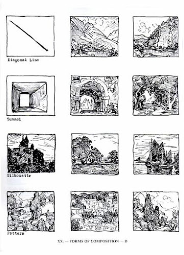
The final row shows both interiors of the space shuttle where the game starts with more development of alien terrain as well as dying fauna, I liked the idea of these panels showing establishing shots, parts of the game with a circular composition and highly screen-shottable when looking at the game as an art piece and relying on the idea of it appearing beautiful in style giving a sense of peace whilst journeying through it despite the deeper meaning behind it. Composition within the panels can have an important affect on the player and has played a key part of the creation of art pieces in terms of directing the viewers eyes across a piece of art and when detailed by Edgar Payne he found the following 15 archtypes.


The circle was a prominent shape in Renaissance art, used in paintings, frescoes, reliefs and murals to create a balanced composition and ideal human figures. The circle was also used in ecclesiatic architecture, such as Filippo Brunelleschi's Pazzi Chapel. The Renaissance period of art was primarily produced during the 14th, 15th, and 16th centuries in Europe under the combined influences of an increased awareness of nature, a revival of classical learning, and a more individualistic view of man. Scholars no longer believe that the Renaissance marked an abrupt break with medieval values, as is suggested by the French word renaissance, literally meaning "rebirth". I love the idea of this word meaning rebirth, taking it metaphorically as an approach to what the player character achieves by journeying through the game and coming through the other side changed, but also the circular composition displaying the cyclical nature of life and journey we undertake within it. Looking at characteristics displayed within Renaissance paintings could open the door to experimenting with oil painting for the art style due to it being prevalent within this style, I want to pay more attention to the compositional themes present especially the effects of circular composition and its uses and how it can be experimented with in moving image compared to still life. Since having such a round shape be the dominant structure in the formation of the environmental art would juxtapose the triangular shape being used with the character design process I have already established and would play a part in representing the idea of the player character not belonging here but also offer unique design opportunities with the player character being a triangular form which rounded shapes are placed upon to design the suit and the environment having a circular composition with which sharp jagged rocks like basalt columns can detail.


Learning Agreement for my final module XB4406

   NAME - John Michael Padden MA COURSE - MA Game Design DATE - 04/01/2025 VERSION NUMBER 4 Brief Explanation / Outline of Project / What?  ...